

case studyMajor Minor Music Australia
Service: Brand Evolution
A brand that finally matches their mission
The challenge
Major Minor Music Australia had grown well beyond the brand it was working with. As the organisation's role in Australia's children's music scene expanded, the identity built years earlier stayed put. The logo, the colours, the overall visual language: none of it reflected the full scope of what the organisation had become.
This wasn't a case of a brand that had never worked. It was a brand that had worked, and then been outgrown. As Benny put it:
"We needed new branding as the old was becoming outdated and no longer reflected the full nature of what we provided as a service."
There was also history to navigate. Taiyo had previously built a sub-brand for the Australian Children's Music Awards, an offshoot of Major Minor Music Australia. That project had gone well. This one had to earn the same trust at a bigger scale, on the organisation's primary identity rather than a satellite brand.
The process
Research and positioning. Before any concepts were sketched, the groundwork went into understanding where Major Minor Music Australia sits in the landscape: not just other children's music organisations, but respected bodies with the same weight and credibility the brand needed to carry.
Two distinct directions. Rather than presenting one safe option, the brief was explored through two genuinely different creative territories, each with its own logic, palette, and reference points. One leaned into authority and permanence. The other leaned into warmth and momentum. Both were built out fully: logo lockups, colour systems, typography, and mood boards, so the choice between them was a real one rather than a formality.
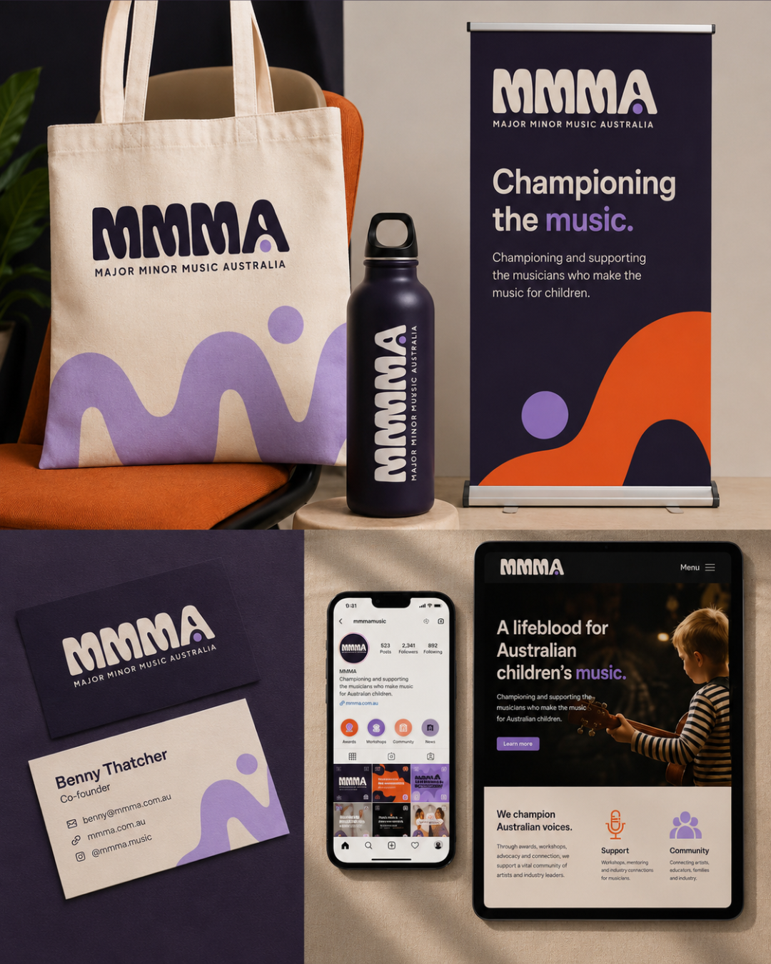
Collaborative refinement. The concepts were shared with the Major Minor Music Australia team for feedback and direction. From there, the chosen path was refined into a complete identity: a logo that works as both the "MA" mark and the full name, a considered colour palette, free-for-commercial-use typography, and a mini brand guide the team can actually use day to day.
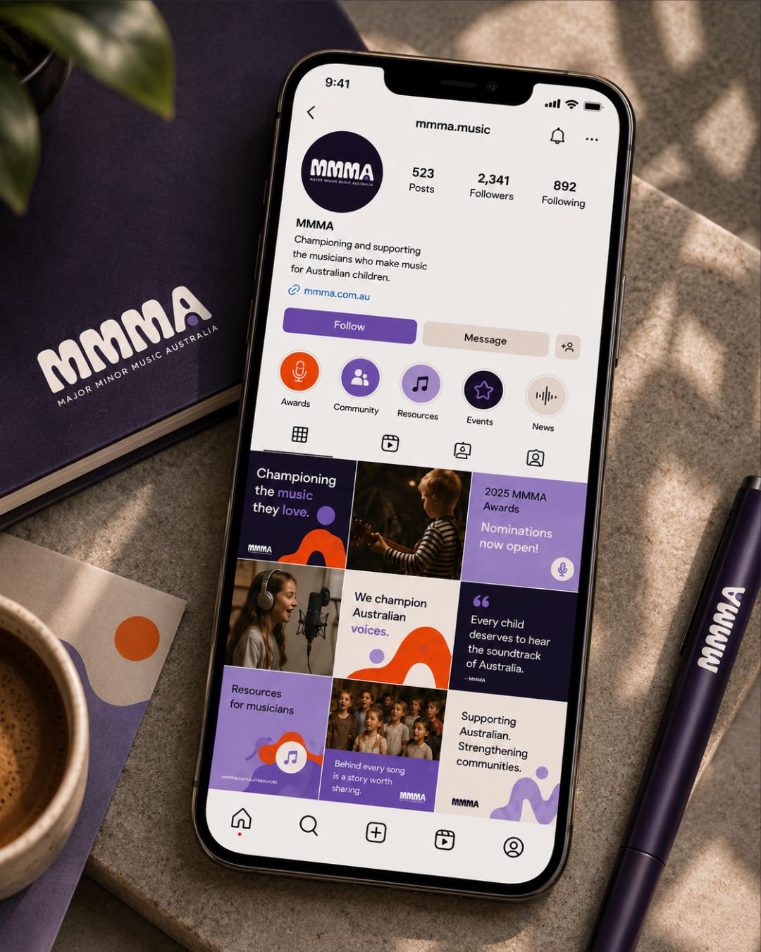
Built for how the brand shows up. Beyond the core identity, the work extended into the practical: social banner templates and a Mailchimp header, so the new brand looks consistent the moment it goes live, not just in the guide.
The result
The shift wasn't just visual. It changed how the organisation feels about presenting itself.
"As an organisation we feel more relatable, professional and confident in putting our feet forward. Prior to this we were stuck in our own version of what we 'thought' we should be, whereas now we have comfortably stepped into the brand we feel we are."
Handing over an organisation's visual identity, something built over years of work, is rarely simple. Benny was candid about that:
"Handing over the visual representation of your life work is tricky and filled with anxiety. That hesitation was lost instantly with Monika."
And when asked if he'd recommend the process to someone in a similar position:
"Absolutely. It was an incredibly easy process and one I felt enormously comfortable within."
"Handing over the visual representation of your life work is tricky and filled with anxiety. That hesitation was lost instantly with Monika."
— Benny Thatcher,
Founder & Director of MMMA
Have a brand that needs a face-lift?